
Reflections from London Design Festival: the palette setting the tone
Many homes still wear the cool neutrals of the past decade: grey walls, pale wood, crisp white. At London Design Festival this autumn, the mood had clearly shifted. In showrooms and interior stores across the city, the same warm, earthy shades kept coming back.
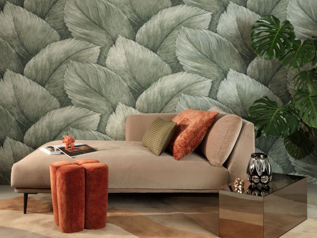
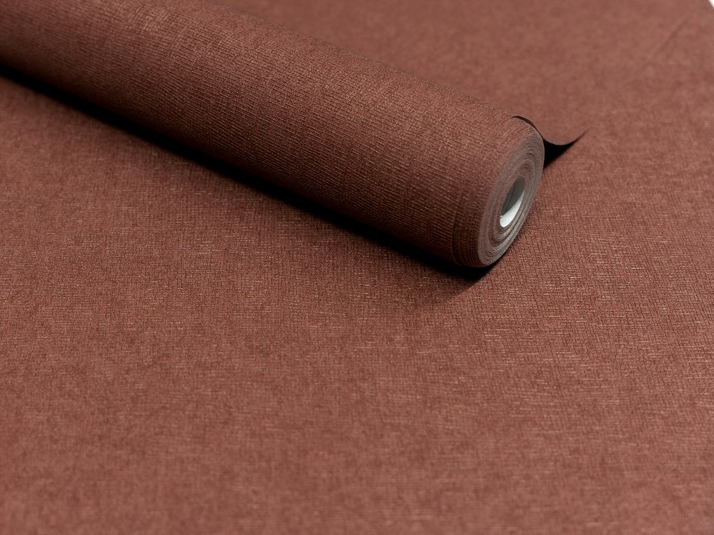
The colors on show
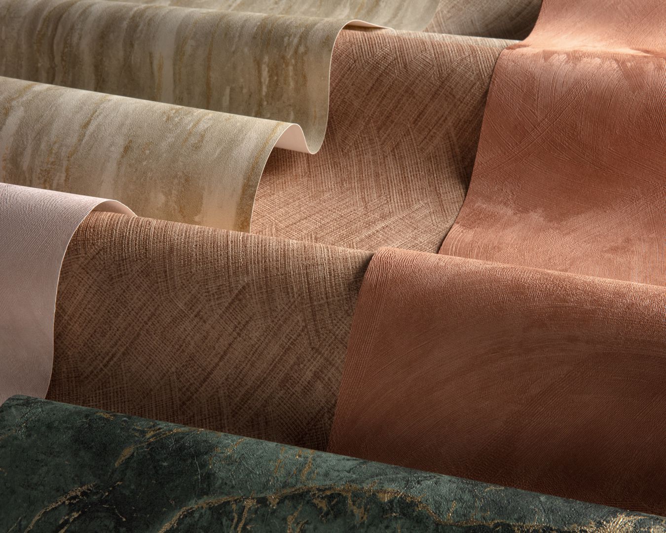
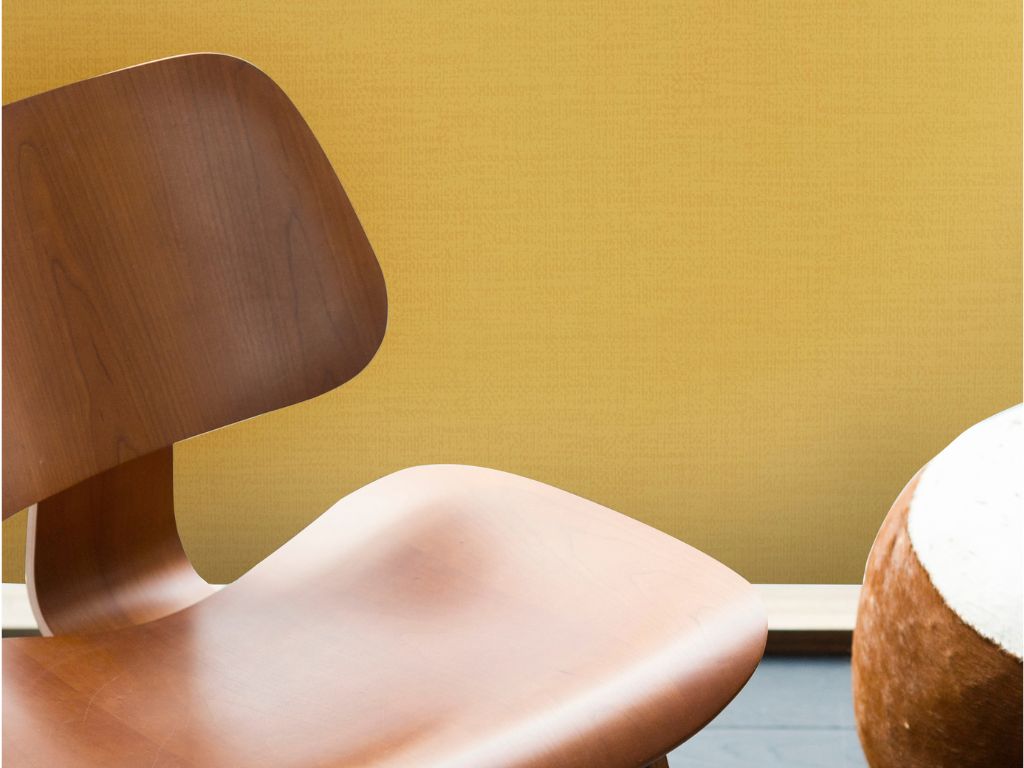
Ochre, mustard and burgundy appeared again and again, alongside warm browns. Green held its own amongst them, balancing the warm earthy tones with a fresher, leafy note. The whole palette comes straight from nature, fitting for the times as when so much feels uncertain, the colors of the earth feel grounding. In terms of materials, dark wood and bouclé completed the picture.
Ochre stood out in particular. It's often linked to the seventies, but its roots go much deeper. Centuries-old ochre homes still line the streets of Florence and Siena. That history gives it staying power. Today it reads almost like a new neutral. It's softer than beige, with far more character.


A softer final note
Alongside the deep tones, one gentle shade caught the eye. It sits somewhere between rosé and salmon, leaning towards champagne. It appeared in interiors and in fashion alike.
This shade changes with the light. Depending on the daylight and the colors around it, a salmon pink can look soft and rosy or closer to a muted beige. That makes it a subtle partner for the richer colors. It also works on its own as a calm choice for a bedroom.